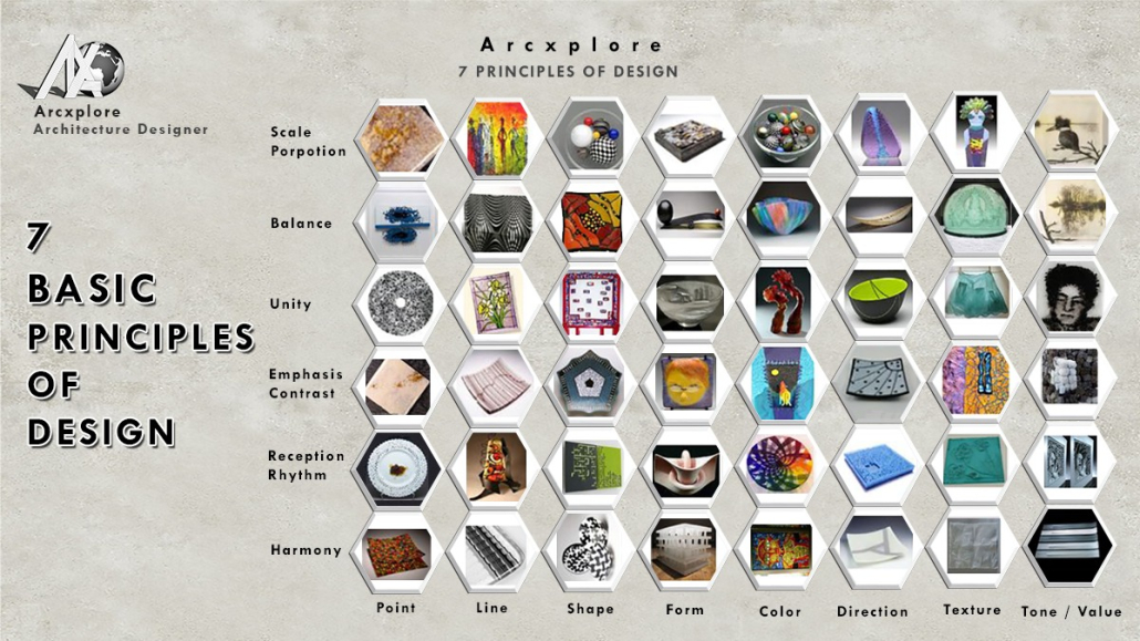
Principles of Design
Definition
What’s the Principle of Design?
Principle of design components such as line colors and textures, which we employ in our compositions and artwork. These components function similarly to ingredients in a recipe. We wouldn’t know what to do with these ingredients if we didn’t have the right recipe. The design concept is akin to a recipe that instructs us on how to use various design aspects.
“The laws of designing anything,” according to the principles of design. They show you how to employ design elements in any composition.”
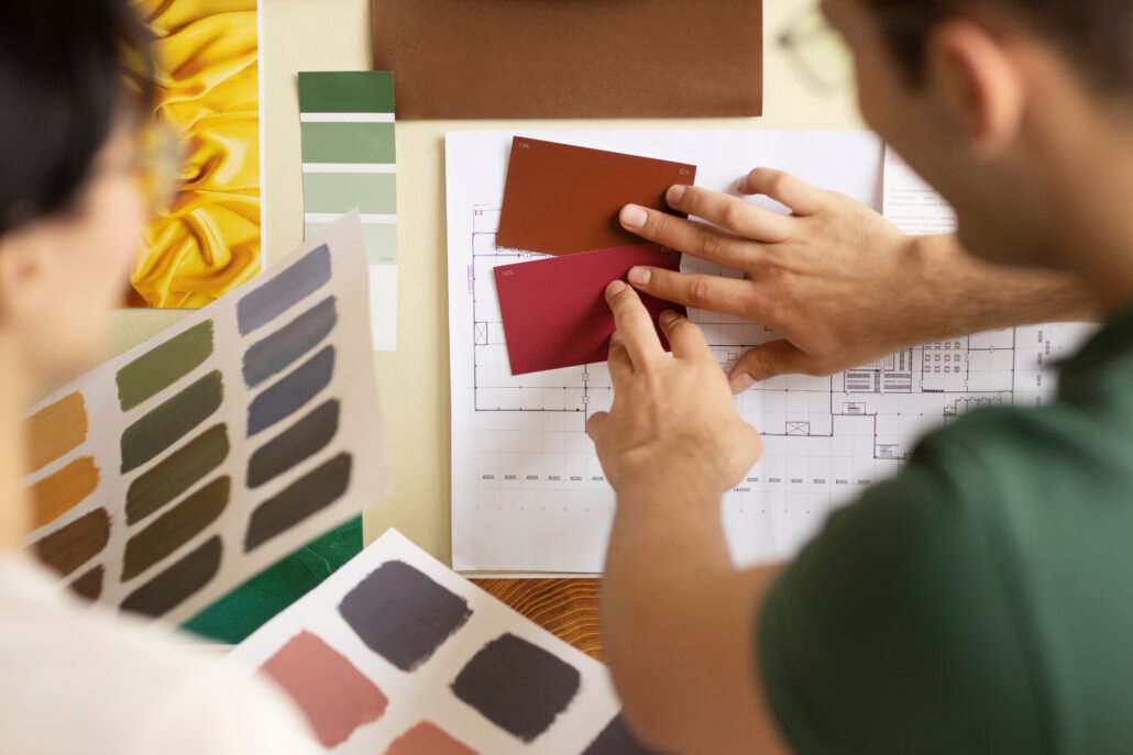
In simple words principle of design, a set of rules which need to be followed by every designer to create an effective and attractive composition basically principle of design, Give us a layout to use elements of design so that we can make a composition that looks good and is also able to convey the message. These principles are used in every field of art, whether it made to be created the world flash paintings or to create world-class architecture. These principles also help us to achieve balance and unity and other compositions.
So these are the seven important principles of design,
7 Principles of Design
Balance
Rhythm
Emphasis
Proportion and Scale
Movement
Contrast
Unity
Balance
To create balance. The elements of your design should be distributed in such a way that it creates a sense of stability. It should be both physical and visual stable. They are many kinds of balance.
Types of Balance:
- Symmetrical Balance or Formal Balance
- Asymmetrical Balance or Informal Balance
- Radial balance
- Vertical balance
- Horizontal Balance
Symmetrical Balance Formal Balances
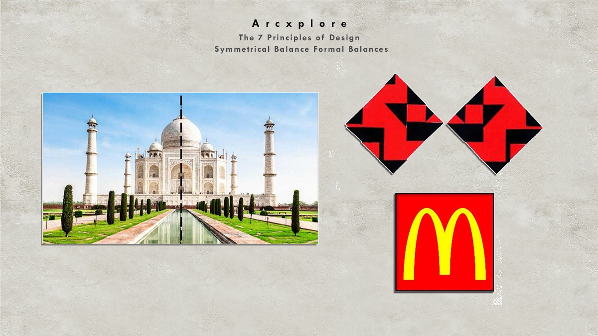
Then we can divide the composition from the central axis into two identical sides. Then we can say that it is having a symmetrical balance in this picture. When we divide the picture from the center, we can see that it has two similar sides. As a result, this image has a symmetrical balance.
This is the famous logo of McDonald’s, which is made on the concept of symmetrical balance.
The principle of symmetry is used in many notable architectural masterpieces. The Taj Mahal (Mughal Architecture) follows the same principle.
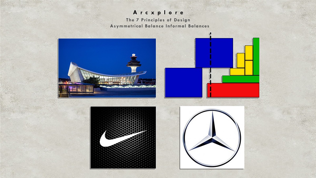
Asymmetrical or Informal Balance
Asymmetrical balance, also known as informal balance, happens when there are different aspects to be exhibited on both sides of a composition. Nonetheless, the composition of this illustration appears to be balanced. We can see how this large blue square in this composition balances out the smaller rectangles. On both sides, the elements are distinct. However, this composition appears to be balanced as a whole
Throughout This structure is also symmetrically balanced. The extended roof and other architectural aspects are balanced by the Tower. This structure is not symmetrical. Still, it appears to be well-balanced.
Symmetrical and asymmetrical balance is used in the designing field. The Mercedes symbol is designed on the basis of the symmetric balance. Where is the Nike? The symbol is designed on the basis of Asymmetrical balance
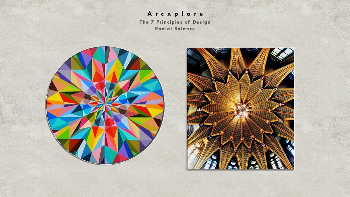
Radial Balance
When elements radiate from the Common Center, radial equilibrium is achieved. This form of equilibrium produces a strong focus point, and the viewer’s gaze is naturally driven inward into the center
Vertical Balance
Vertical balance occurs when we can divide the composition vertically into two halves, as we can see in the picture given below:
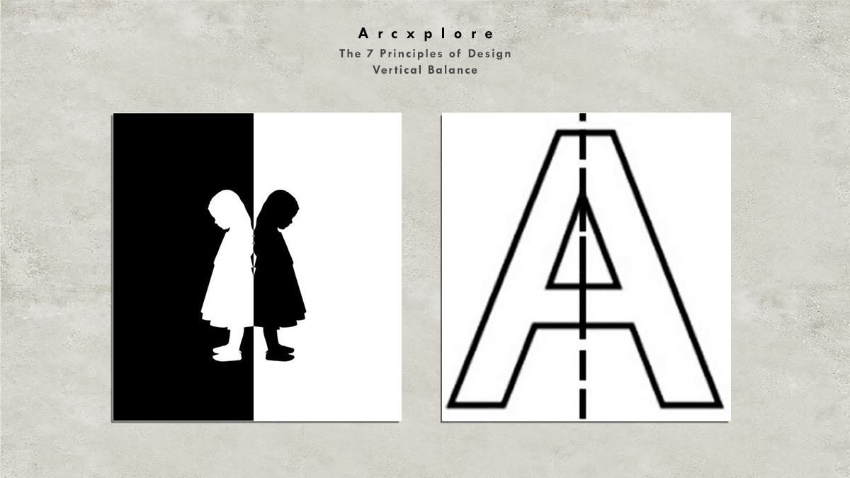
That when we divide the image in half from the middle, we get two identical sides. Similarly.
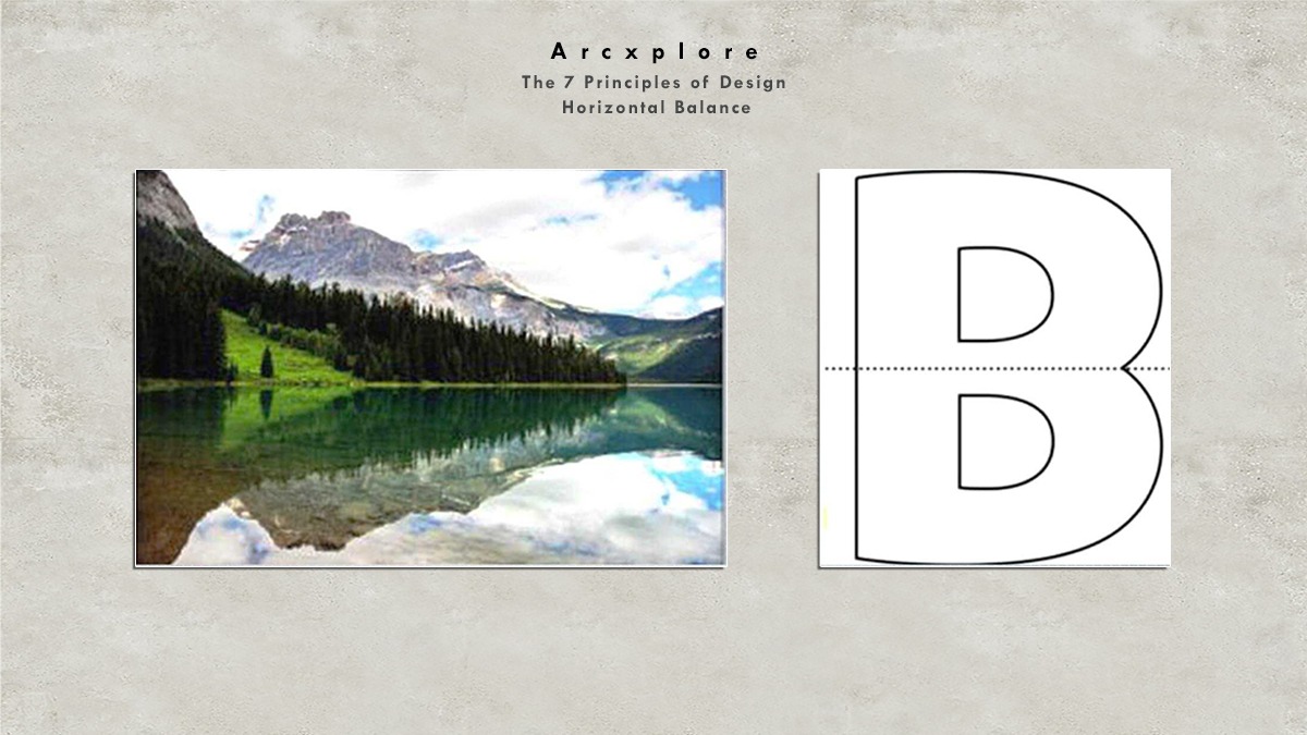
Horizontal Balance
Horizontal balance is achieved when the image can be divided horizontally into two Harps. It also produces two similar sides at the top and bottom
Rhythm
What’s the Principle of Design
The second principle of design Rhythm, The repeated use of lines, textures, colors, or any pattern in a composition, or a design is called Rhythm.
Types of Rhythm:
- Regular Rhythm
- Random Rhythm
- Gradated Rhythm
- Graduated Rhythm
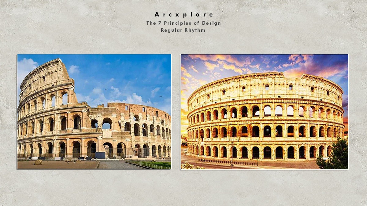
Regular Rhythm
Regular rhythm, as the name implies, refers to the repetition of an element in a design’s Intervals. The diamonds in the first image are repeated on a regular basis to create a pattern in the Monument’s design. The arch Windows is also repeated on a regular basis to create a rhythm.
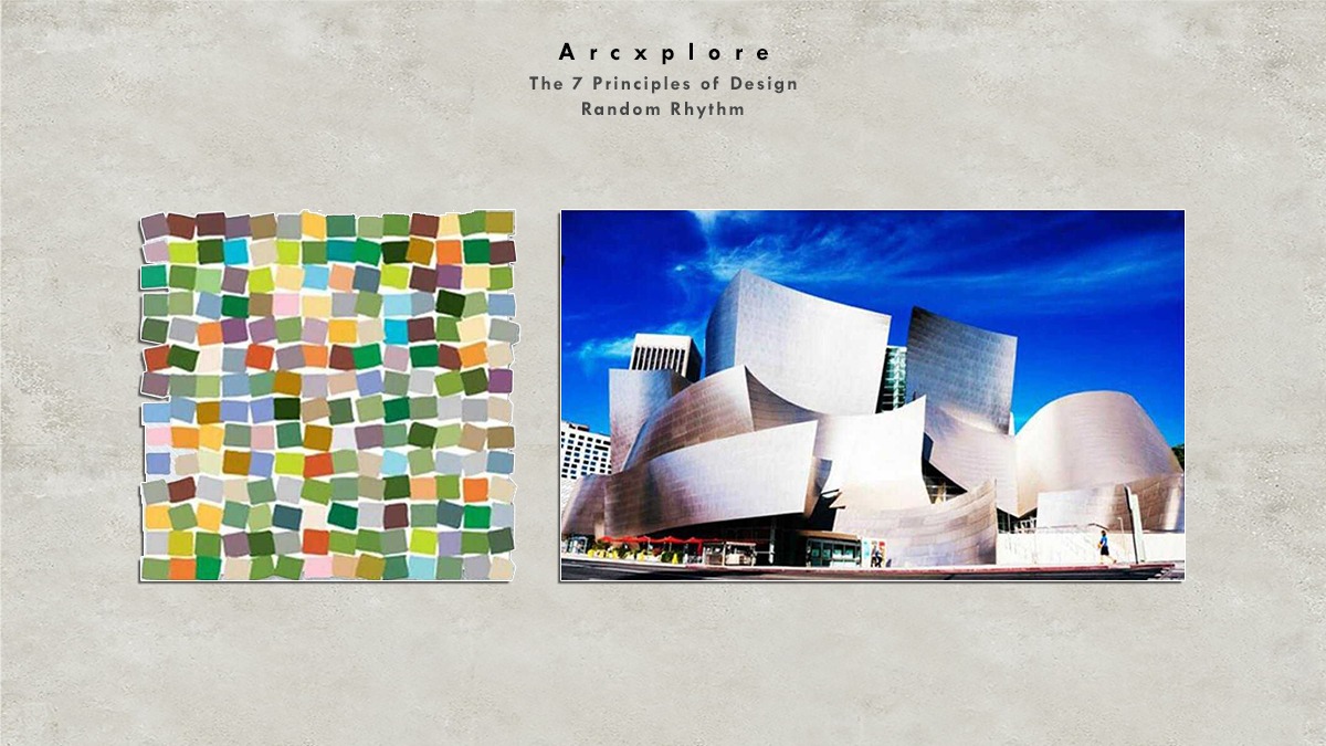
Random Rhythm
Opposite of regular rhythm is random rhythm in this kind of Rhythm, Elements are repeated at regular intervals in the design below both figures are examples of random rhythm.
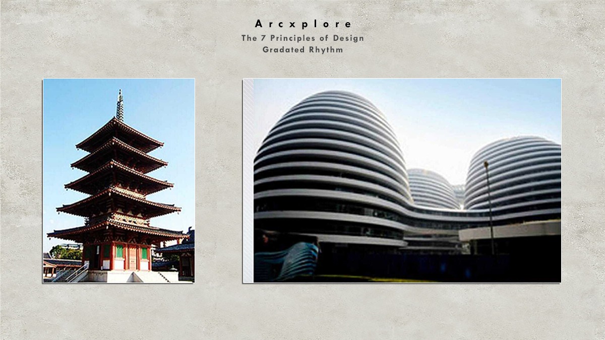
Gradated Rhythm
The Gradated Rhythm in this kind of rhythm element is identical. However, it might be increasing, or decreasing with each repetition in the first picture of the pagoda, we can see that the top of the Pagoda is having the same elements. However, with each step, the size of that element is increasing. The same is the case. The case of this modern architecture.
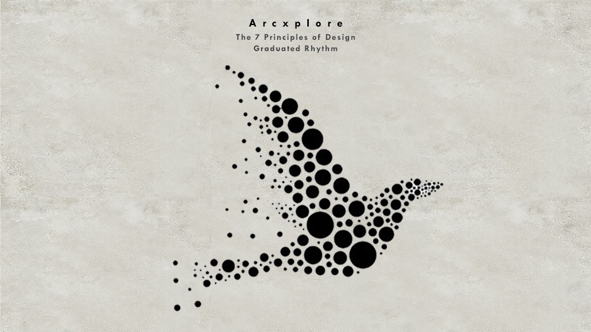
Graduated Rhythm
In this type of Rhythm, there is a graduated Rhythm. The pieces are put too close together or too far apart to make a composition. In the image below, the circles are placed too close together in some spots. And, in other cases, a little too far away to construct a bird composition. A graded rhythm is demonstrated in this example.
Emphasis
The third principle of design is emphasis. It is a very important principle. As the name suggests, emphasis is used to draw attention to a particular element in a design. It is to aim to create a focal point in a design Emphasis can be achieved through.
- Emphasis by Contrast
- Emphasis by Isolation
- Emphasis by Location
- Emphasis by Convergence
- Emphasis by Uniqueness
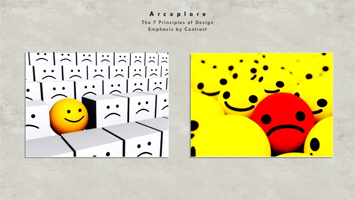
Emphasis by Contrast
First picture the shape color, and the war have been used to focus the yellow smiley ball in the second picture. Also, the shape is similar. However, the color and the mood has been used to create the focus on the red sad Smiley.
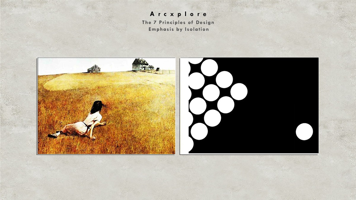
Emphasis by Isolation
The one Circle has been isolated from the group of other circles in the original image. I, on the other hand, was drawn to the solitary Circle. The painter has isolated all three aspects in the second painting, the two houses and the girl lying on the floor. The painter does this by emphasizing all three components.
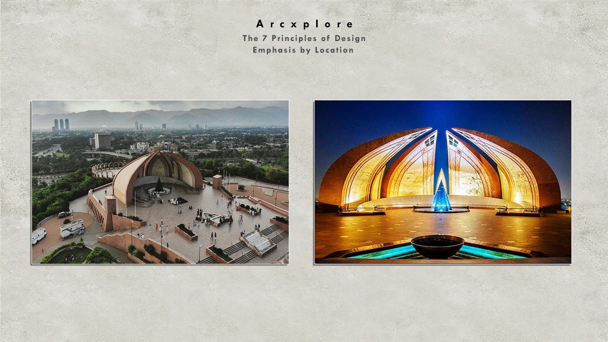
Emphasis by Location
This is the emphasis by location. The area around the Pakistan Monument Museum is designed in such a manner that the focus is only on the monument.
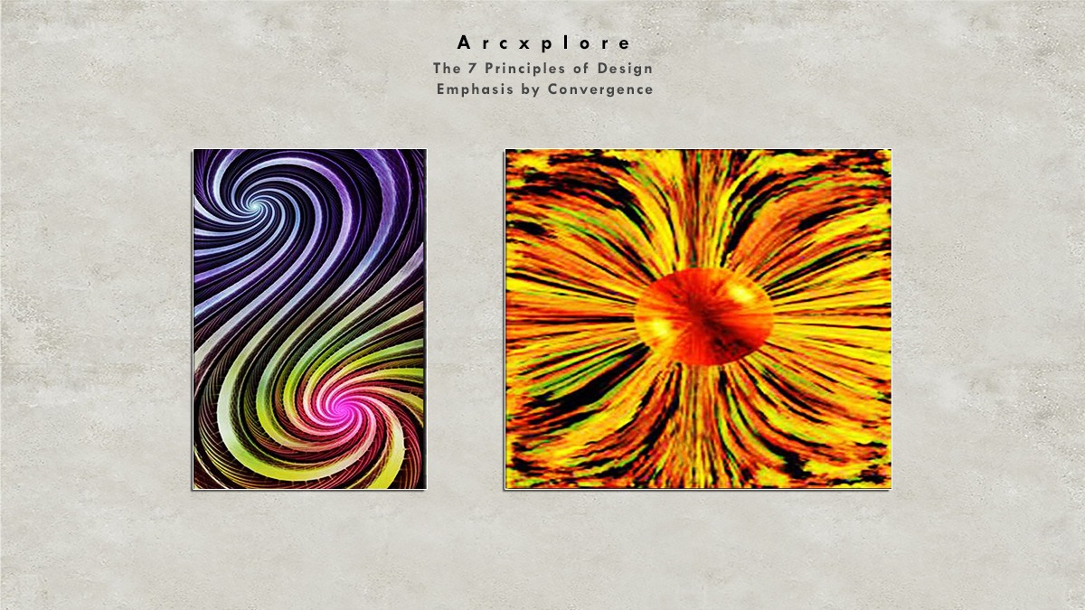
Emphasis by Convergence
This is the emphasis of convergence. As we can see, the elements of design are converging into a point and the focus is on the converging point.
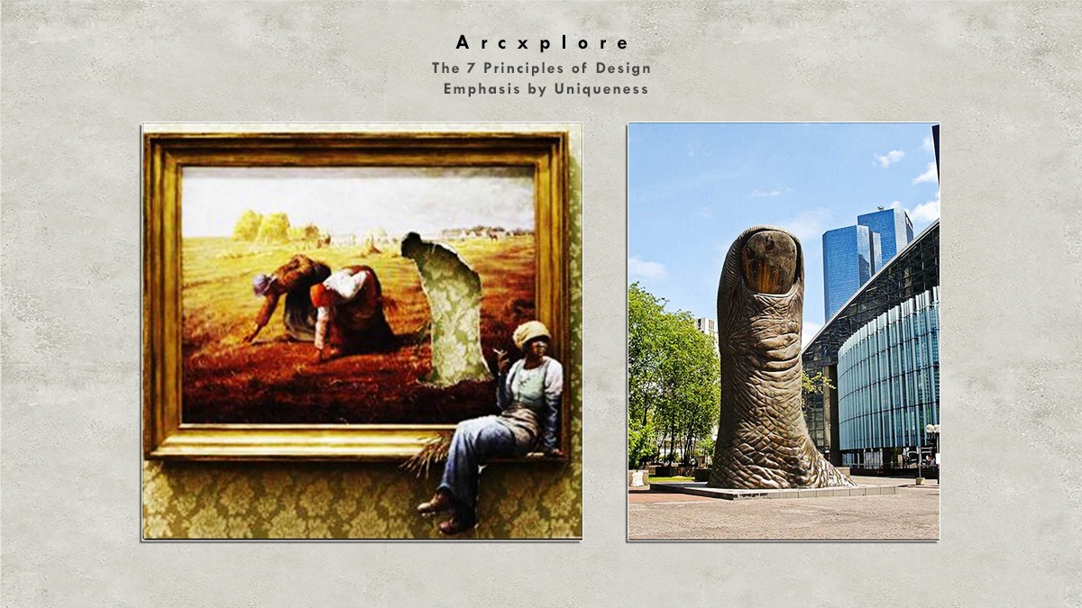
Emphasis by Uniqueness
This is the emphasis on uniqueness or unusual. In this kind of emphasis an unusual element is added to the design to create the importance or uniqueness of a design, as we can see in both the pictures that unusual elements have been added to capture the attention of the viewer.
Proportion and Scale
The fourth principle of design is proportion, and scale is nothing but the size of each element on the design and proportion is the size of an element in comparison with the other object of the element 3 is to 5 ratios is considered to be the golden mean. Both the figures given below are our examples of size and proportion in both the pictures the size of one element has been increased to give focus on that element. In the first picture. It is a size of a ball. And in second the size of a lamp.
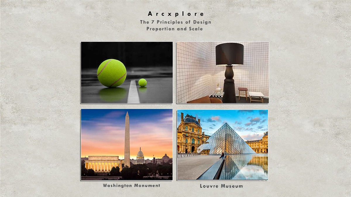
Washington, DC is the name of the city. In this image, we can observe how it has been landscaped using the size and proportion principles. Each landmark in this photograph has its own distinct personality and purpose
This is the famous Museum of Paris here. Also, the scale and the proportion principle has been used to design the pyramid to balance with the other features of the architecture
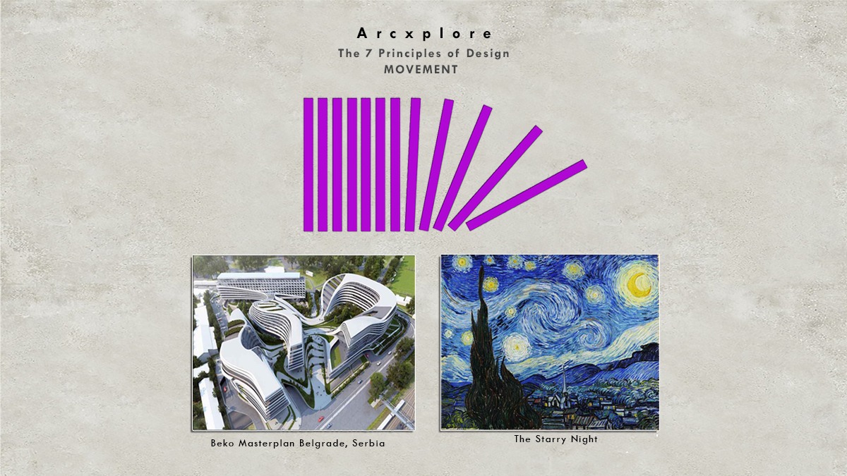
Movement
The fifth design principle is movement and the artist produces a sense of motion by using movement. It aids in the creation of a path for the spectator. It also provides the design a sense of fluidity and allusion.
Zaha Hadid, a well-known architect, built this flowing structure. The notion of mobility has been considered in the design of this building, as well as how it creates portions for the river and allows it to flow
The Starry Night, a well-known picture, likewise employs the principle of movement by generating circular patterns and allowing the design to flow.
Contrast
The sixth principle of design is contrast. Contrast is when two or more elements in a design or of different qualities, can be achieved in form like color, texture, size, proportion, shave movement, etc. Contrast is being achieved by changing the color of One Umbrella.
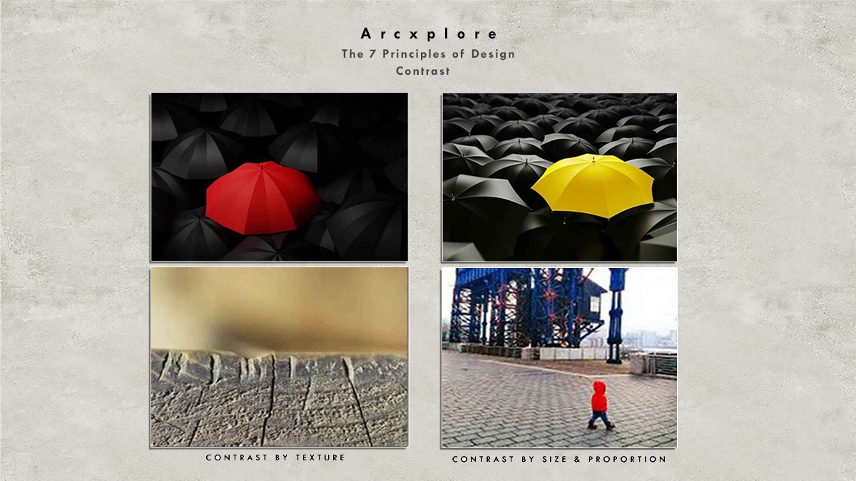
The texture contrast in the first image is an example of this. And second image shows how size and proportion can be contrasted.
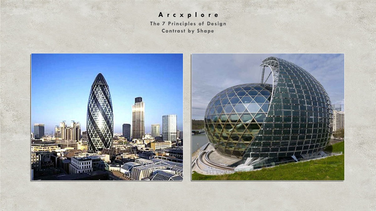
The example of form contrast. This Oval Buildings would not have attracted as much notice if it had been in a typical rectangle shape, as it is now.
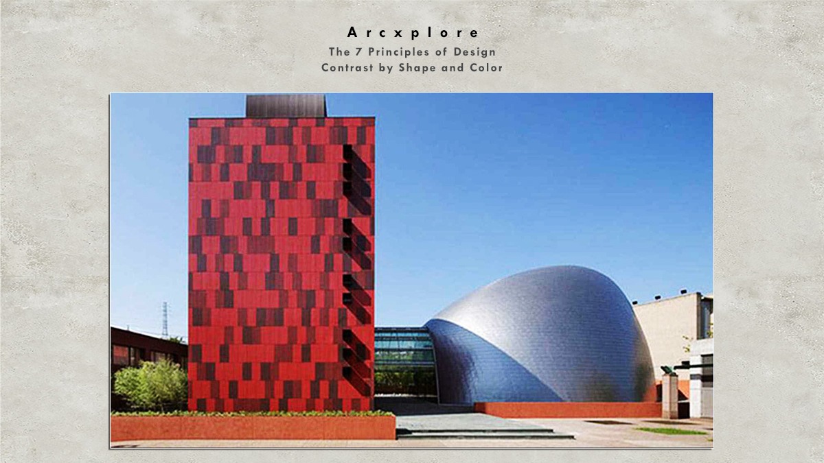
This is also an example of shape and color contrast. The originality of this design is a striking contrast between these two structures.
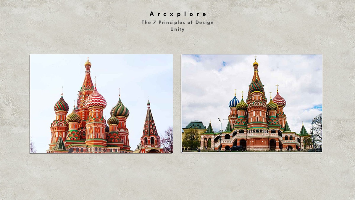
Unity
Unity is the eighth design concept. Harmony is another name for unity. The unity principle gives a design a sense of order or wholeness. It can only be accomplished if all of the design aspects are in sync with one another.
This is a perfect example of unity. The architectural design of St. Basil’s Cathedral is using. So contrasting features shapes colors. However, they are in balance with each other. It is creating perfect harmony and unity.