The Five Principles of Design
What are the 5 principle of design? The five principles of design are fundamental guidelines for creating effective visual compositions.
The Five Principles of Design are:
What are the 5 Principle of Design?
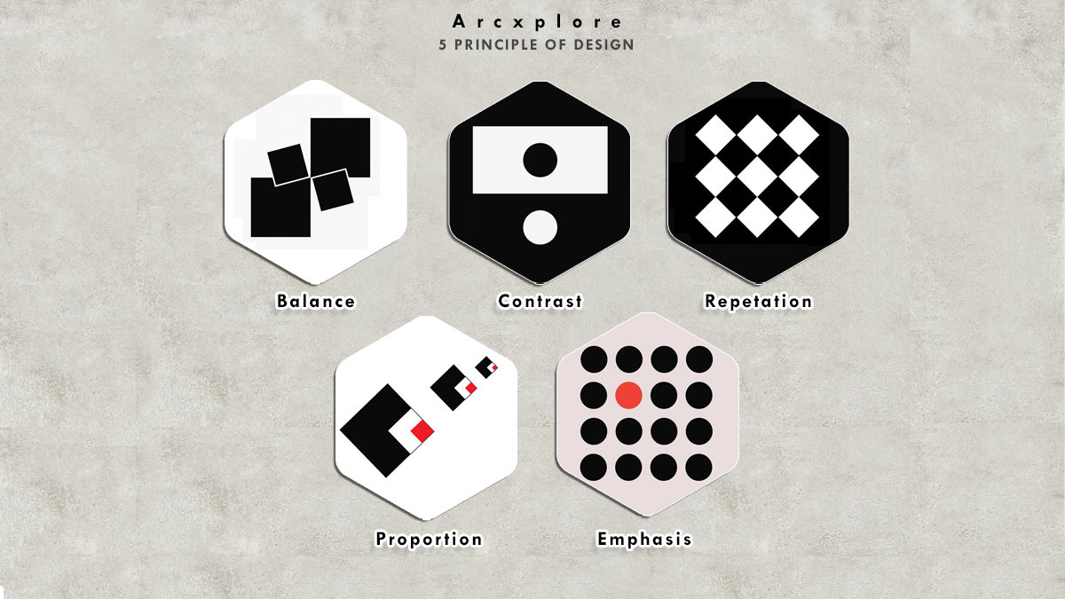
- The division of visual weight within a composition is known as Balance.
- Contrast the use of opposing elements to create visual interest and emphasis
- Emphasis the creation of a focal point within a composition
- Repetition the use of repeated elements to create unity and cohesiveness
- Proportion the relationship between elements in terms of size, scale, and quantity.

Balance
What are the 5 Principle of Design?
Balance in design refers to the distribution of visual weight within a composition. Balance can be classified as symmetrical balance, asymmetrical balance, and radial balance. Symmetrical balance is when elements are mirrored on either side of a central axis, creating a sense of stability and order. Asymmetrical balance is when elements are arranged in a way that is not symmetrical, but still maintains a sense of balance through the use of contrasting visual elements. Radial balance is when elements radiate out from a central point, creating a circular or spiral pattern. Balance is important in design because it can create a sense of harmony and order, and help the viewer navigate a composition.
Contrast
What are the 5 Principle of Design?
Contrast in design refers to the use of opposing visual elements, such as color, shape, or texture, to create visual interest and emphasis. Contrast can be used to highlight important elements, create a sense of depth, or add drama and excitement to a composition. Some common types of contrast include light and dark, large and small, rough and smooth, and complementary colors. Contrast is an important principle of design because it can help make a composition more dynamic and engaging for the viewer.
Emphasis
Emphasis in design refers to the creation of a focal point within a composition, drawing the viewer’s attention to a specific area or element. This can be achieved through the use of contrast, color, size, shape, or other visual elements. By creating a focal point, designers can help guide the viewer’s eye through a composition and communicate the most important information. Emphasis is important in design because it can help make a composition more effective and memorable.
Repetition
Repetition in design refers to the use of repeated visual elements, such as shapes, colors, or patterns, to create unity and cohesiveness within a composition. Repetition can help establish a visual rhythm and create a sense of harmony and consistency. By using repetition, designers can also reinforce the message or branding of a composition. However, repetition can also become monotonous if overused, so it’s important to balance repetition with other design principles to keep a composition interesting and engaging.
Proportion
Proportion in design refers to the relationship between elements in terms of size, scale, and quantity. The proper use of proportion is essential for creating a harmonious and aesthetically pleasing composition. The size and scale of elements should be balanced to create a sense of visual equilibrium. For example, a large element should be balanced by several smaller elements, or vice versa. Proportion can also be used to create a sense of emphasis and hierarchy within a composition, with larger elements drawing more attention and smaller elements playing a supporting role. Overall, proportion is an important principle of design because it helps establish a sense of order and balance within a composition.


