The Six Best Element of Graphic Design
Introduction
In graphic design, there are several key elements that designers use to create visually appealing and effective compositions. Here are six fundamental elements:
Point
Line
Shape
Form
Texture
Color
Elements of Graphic Design
1) Point
Elements of Graphic Design
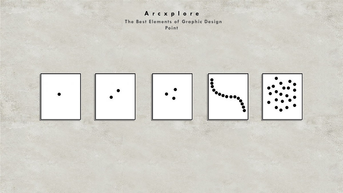
Elements of graphic design is point. The Point is the earliest and most basic aspect of visual design. A point serves as the visual’s focal point, drawing attention to it. Even if there is only one point, or one mark, on a blank paper, our minds will create a sense of it.
In actuality, the visual world is so complex that the mind has developed strategies for dealing with it. A problem’s most basic solution is sought by the intellect. It accomplishes this in a number of ways, one of which is by establishing groups of items with similar characteristics.
2) Line
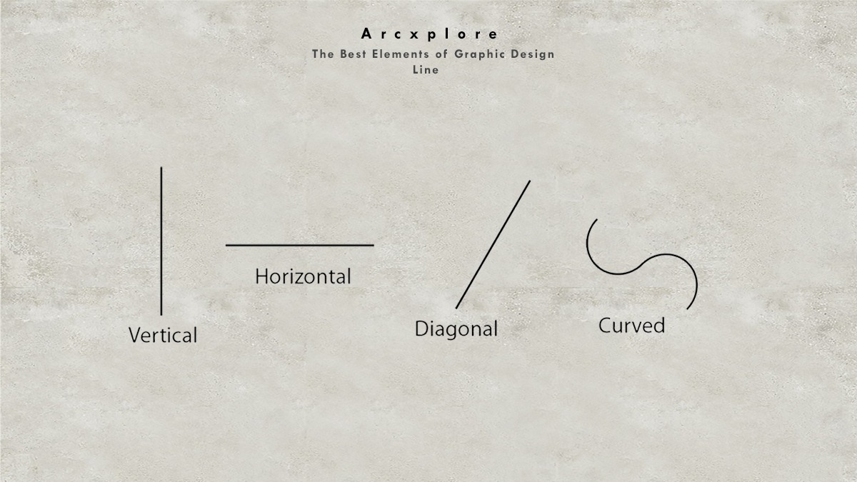
Without a doubt, the line is the most fundamental of all design aspects. Whether it’s a wonderful drawing, painting, or even sketching ideas for a sculpture, it’s where most artistic masterpieces begin. A line is the foundation of almost all designs. So, what is a line, exactly?
3) Shape
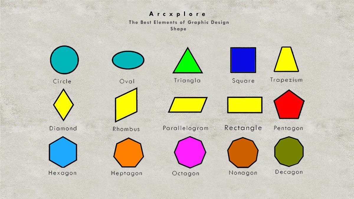
A two-dimensional area defined by a real or implied line is called a shape (an edge for example). Forms are created when the ends of lines are joined to enclose spaces in a drawing.
Types of Shapes:
Geometric as well as free-form or organic shapes Geometric shapes can be described using mathematical terminology.
They are extremely precise or consistent. They are more typically found in man-made products because they are easier to duplicate and construct things with. Geometric forms include squares, rectangles, triangles, circles, ovals, pentagons, and other shapes.
4) Form
Elements of Graphic Design
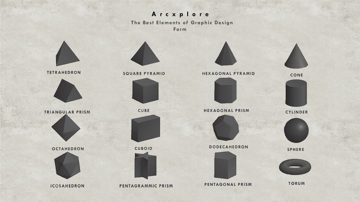
The design element of shape is quite similar to the design element of form. The difference is that in three-dimensional art, the term “form” is used instead of “shape.” The three dimensions are length, width, and depth.
5) Texture
Elements of Graphic Design
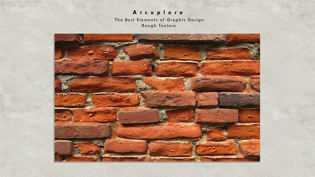
Texture refers to the appearance of a work of art’s surface. Textures are related to the way things look and feel. Everything has a different texture. Rough, smooth, silky, sparkling, fuzzy, and other adjectives are used to describe various objects. The term “real” or “actual” texture refers to how something feels. Although some objects appear to be rough, they are smooth.
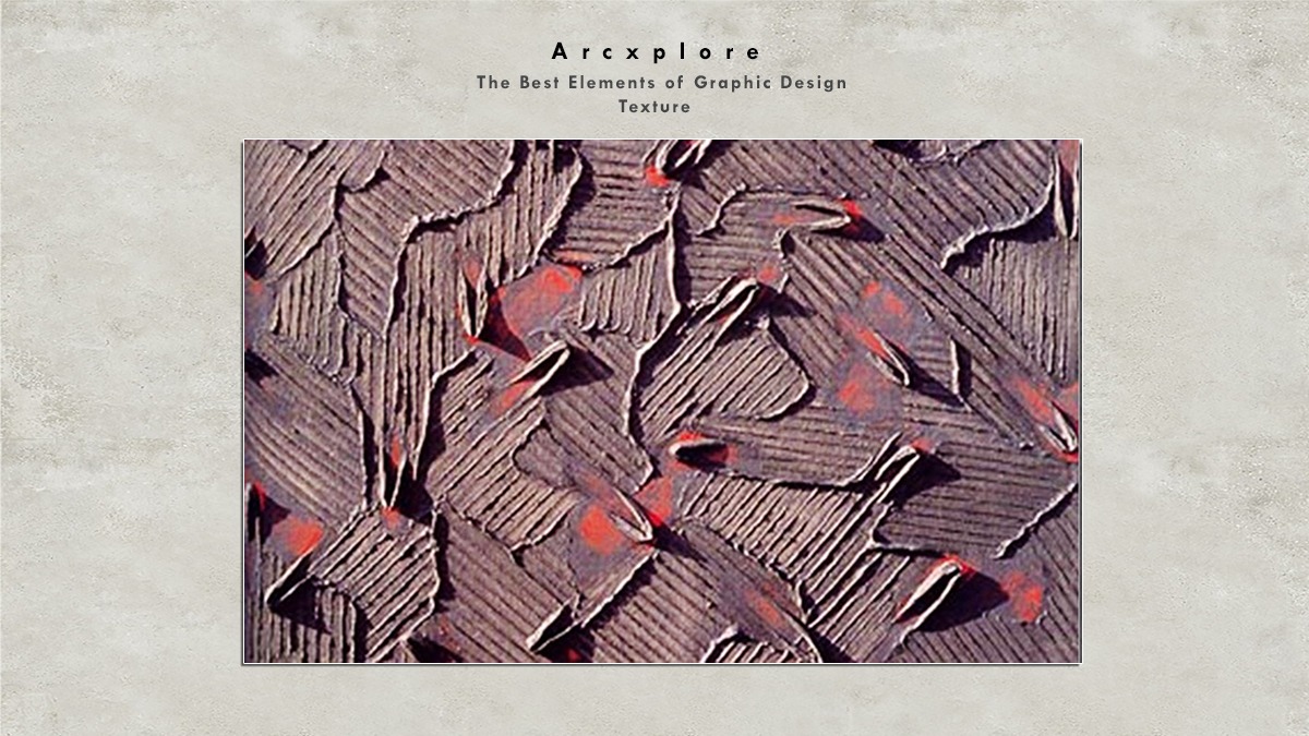
There are two types of texture:
Rough Texture
- How the object feels to the touch
- Can feel the variation in the surface
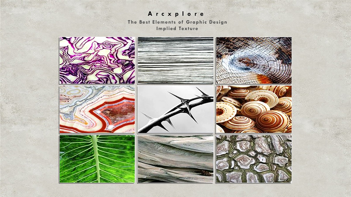
Implied texture
- An illusion is when an object looks to feel differently than it does.
- Applied using line, color, & shading
6) Color
Elements of Graphic Design
The hardest of all the Design Elements to grasp is color. To fully grasp the nature of color, we must first grasp some basic science. Color’s three major attributes are hue, value, and intensity.
What is Color?
A light source, which can be seen directly or reflected, creates color. Light waves in daylight or white light depict all hues. There is no color without light! The absence of light is referred to as complete darkness or blackness. White light is made up of all visible light wavelengths mixed.
White light is made up of all of the rainbow’s colors. Water droplets in the air behave as a prism when light passes through them.
It sorts a tangle of color light waves into wavelength groups. We see that organized structure as a rainbow. The Color Spectrum is a group of colors that always appear in the same sequence. A Color Wheel is a color spectrum that is arranged in a circular pattern.
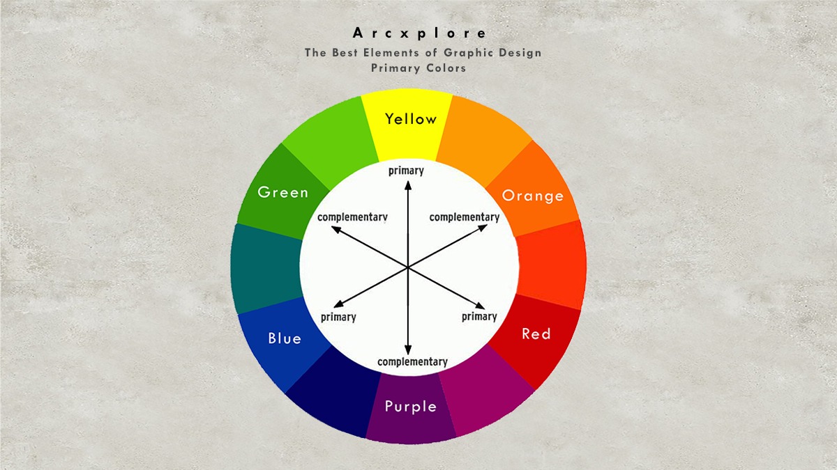
The three primary colors are red, yellow, and blue.
Primary Colors
Red, Yellow, and Blue are the three primary colors.
Red, Yellow, and Blue are the fundamental colors in the world of art. They’re termed primary colors because they can’t be created by mixing other hues, yet they can be blended to create a wide range of colors. By combining black and white, new colors can be formed.
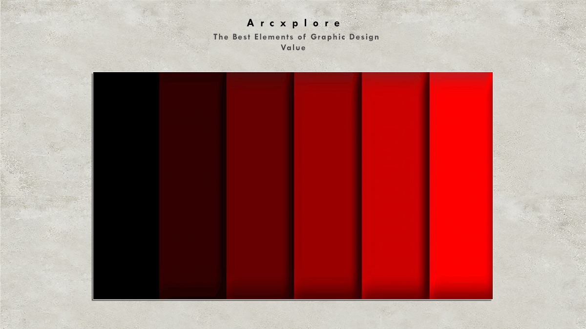
Value
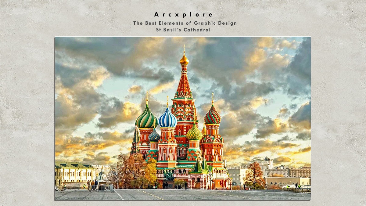
The term “value” in the art world refers to the “value” of light. The greater the number, the more light is available. White is the highest or lightest value. The darkest or lowest value, on the other hand, is black. Colors are valuable in their own right. Yellow, for example, has a high (bright) value and violet has a low (dark) value (dark).
