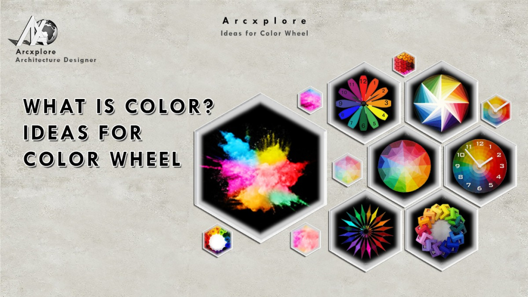
Ideas for color wheel
Introduction
Ideas for Color wheel and definitions (or categories) based on the color wheel are also available. We’ll start with a three-part color wheel.
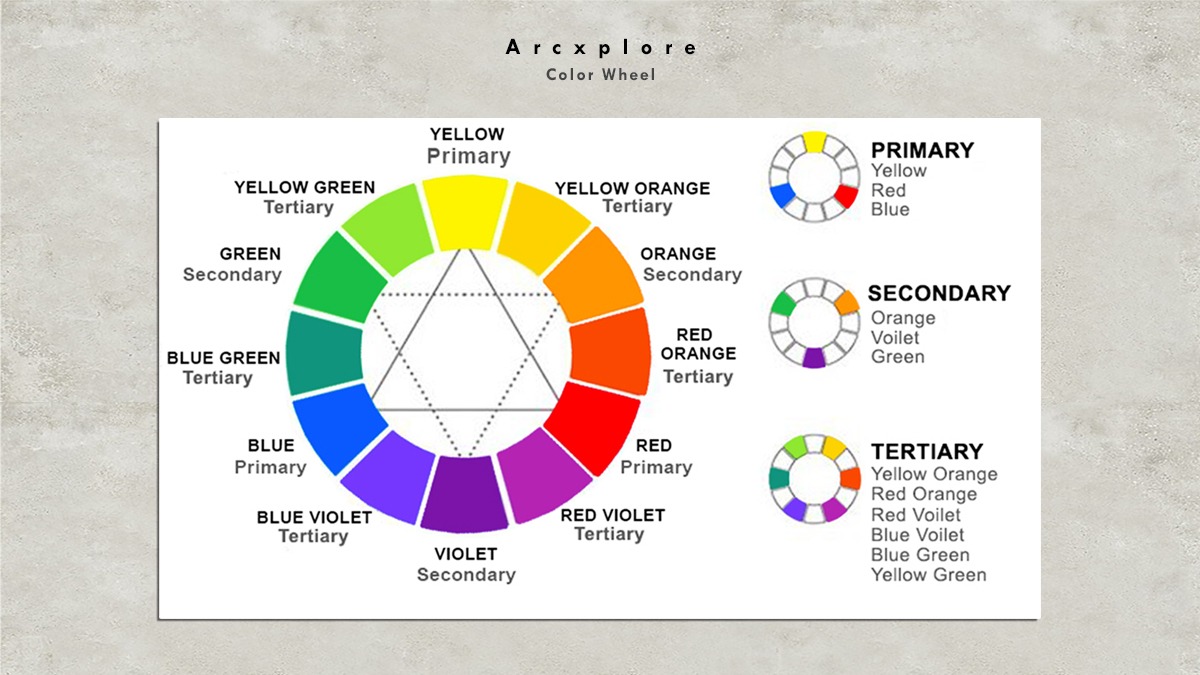

Color Wheel
Primary Colors:
Red, yellow, and blue
Primary colors are the three pigment colors that cannot be blended or created by any combination of other colors, according to conventional color theory (used in paint and pigments). All other colors are built on this basis.
Secondary Colors:
Green, orange, and purple
These are the colors that are created when primary colors are mixed together.
Tertiary Colors:
Yellow-orange, red-orange, red-purple, blue-purple, blue-green, and yellow-green are some examples of Tertiary colors.
These are the colors created by combining two primary colors. That’s why colors with two-word names like blue-green, red-violet, and yellow-orange exist.
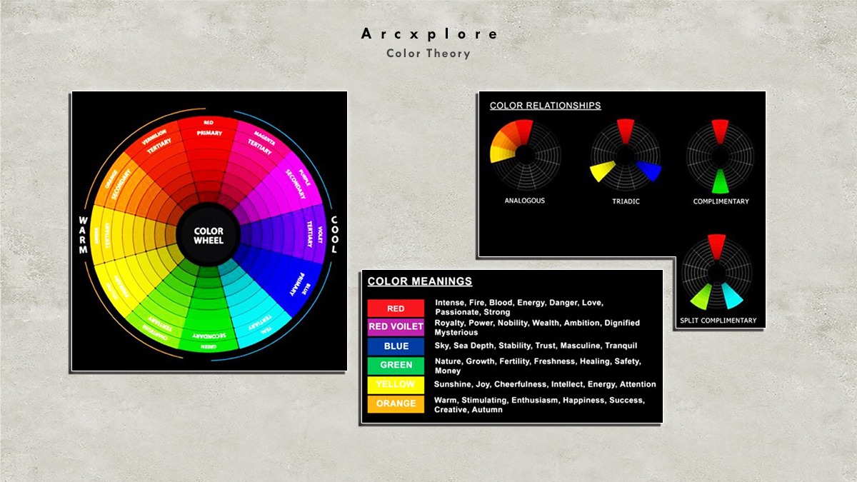
Color Harmony
Music, poetry, color, or even an ice cream sundae can be defined as a pleasant arrangement of pieces.
Harmony is something agreeable to the eye in visual experiences. It draws the spectator in and gives the visual experience a sense of order and harmony. It’s either boring or chaotic when something isn’t harmonized. A visual encounter that is so dull that the spectator is not interested in at one extreme.
Information that is not stimulating to the brain is rejected. A visual experience that is so overdone, so chaotic, that the viewer can’t endure looking at it is on the other end of the spectrum. What the human brain can’t organize and comprehend is rejected. We must offer a logical framework to complete the visual assignment. Color harmony creates a sense of order and aesthetic interest.
Analogous Colors
Harmony can be explained in a variety of ways. Some basic formulas are illustrated and described in the following sections.
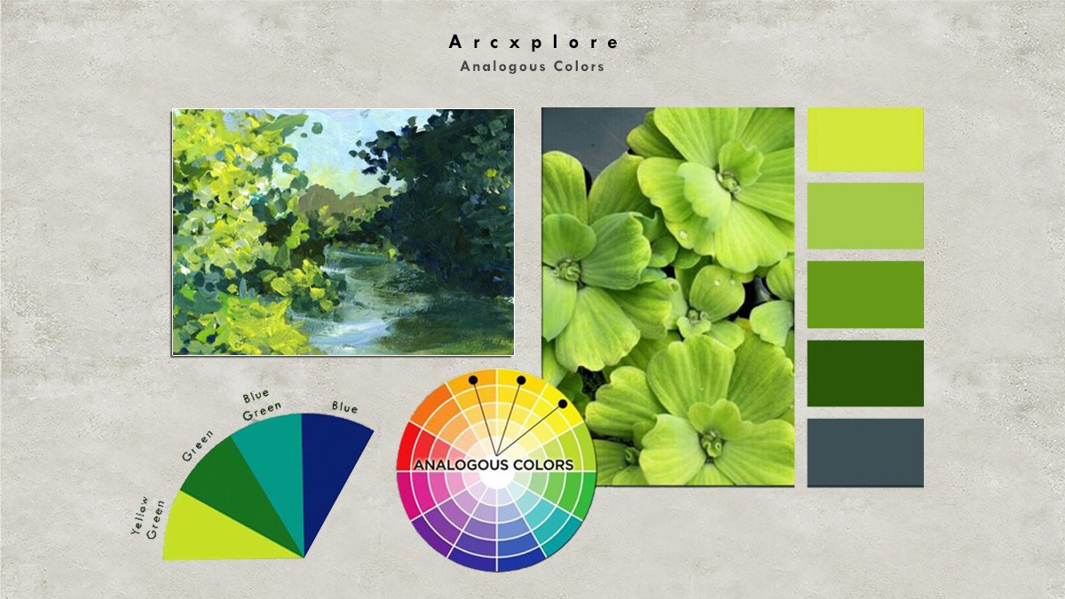
- A color scheme made up of similar colors
Any three hues that lie side by side on a 12-part color wheel, such as yellow-green, yellow, and yellow-orange, are analogous colors. One of the three hues is usually dominant.
Complementary Colors
Any two colors that are directly opposite each other, such as red and green, red-purple, and yellow-green, are considered complementary. The leaves in the illustration above are various shades of yellow-green, while the orchid is various shades of red-purple. The contrast and stability of these opposing colors are maximized.
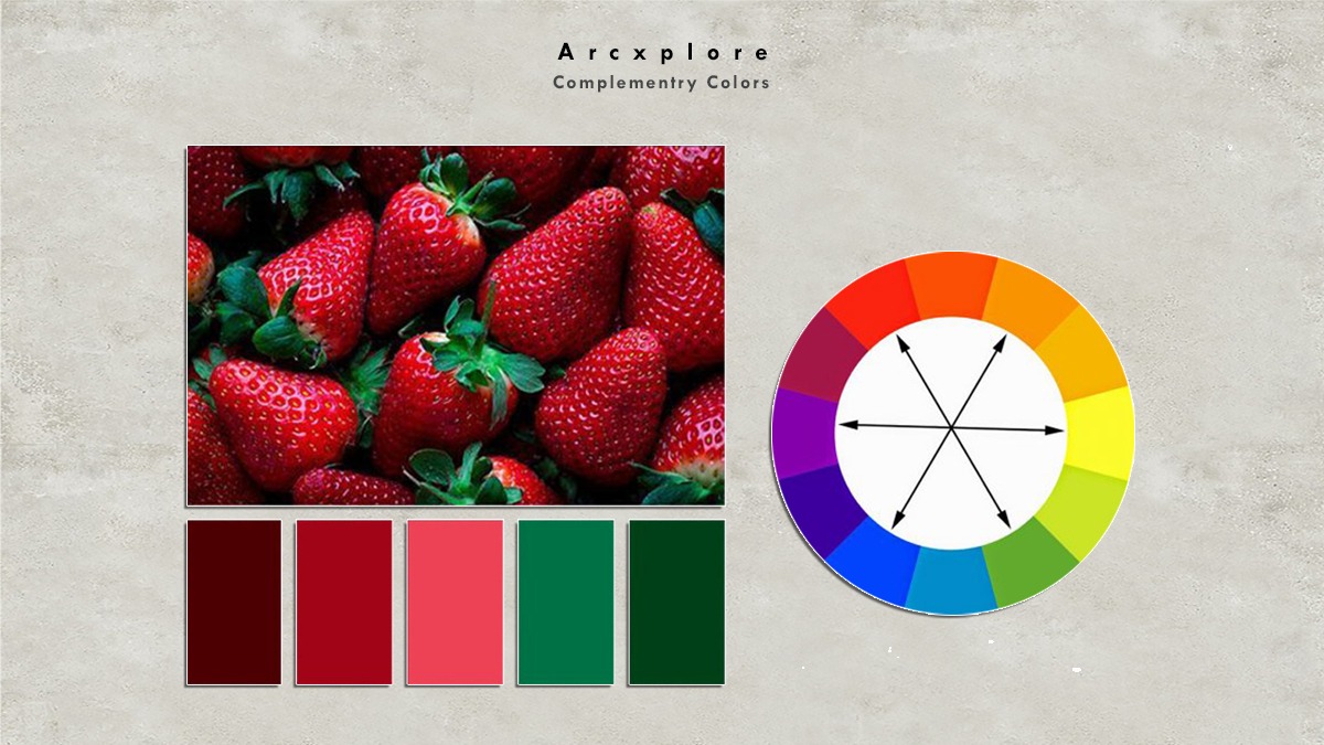
- A color scheme with complementing colors
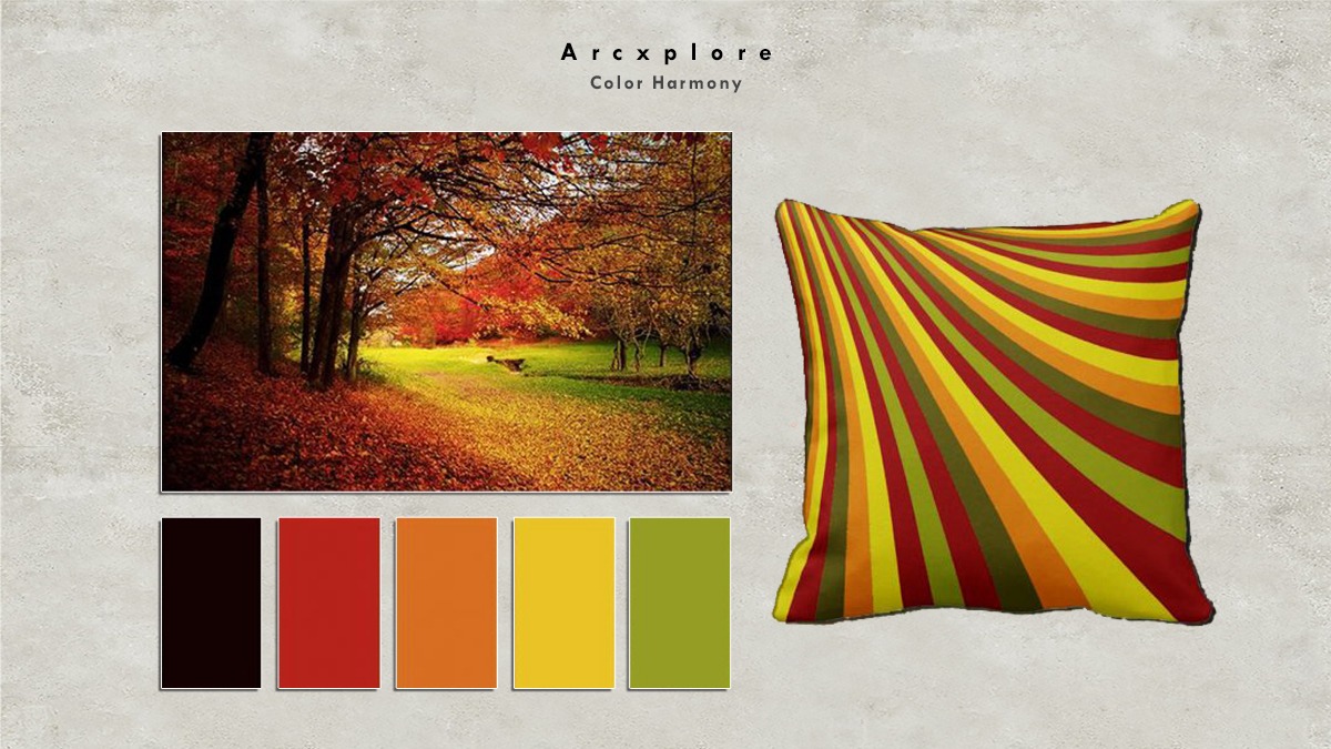
- A natural-inspired color scheme
Color harmony finds an excellent starting point in nature. Regardless of whether this combination fits into a precise formula for color harmony, red yellow, and green produce a harmonious design in the graphic above.